
Colour selection can make or break your exhibition stand’s success. The right colour scheme doesn’t just attract attention—it communicates your brand’s message, influences visitor behavior, and creates memorable experiences. In this comprehensive guide, we’ll explore how to select and implement the perfect colour palette for your next trade show appearance.
Understanding Colour Psychology in Exhibition Spaces
Primary Emotional Responses
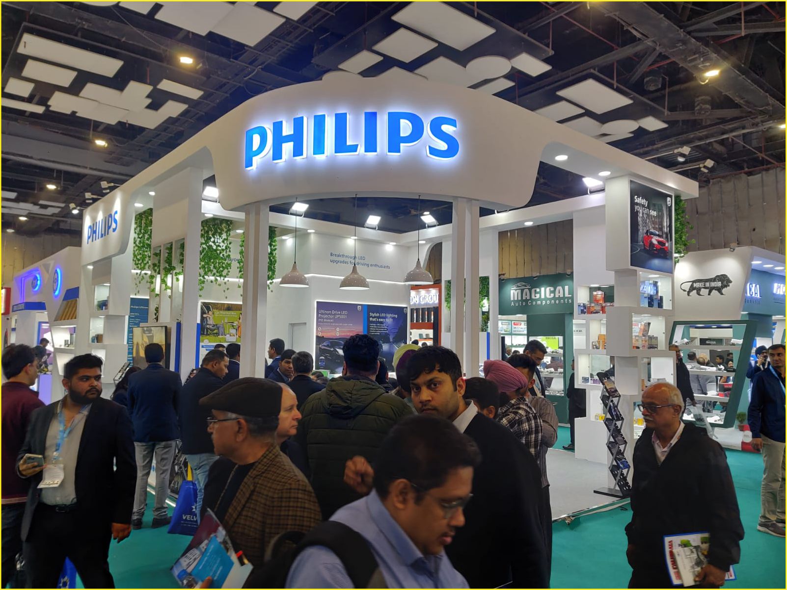
- Blue: Trust, stability, professionalism
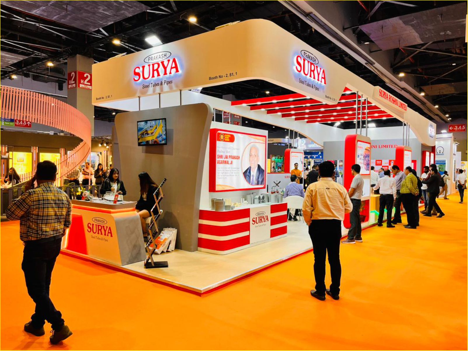
- Red: Energy, urgency, passion
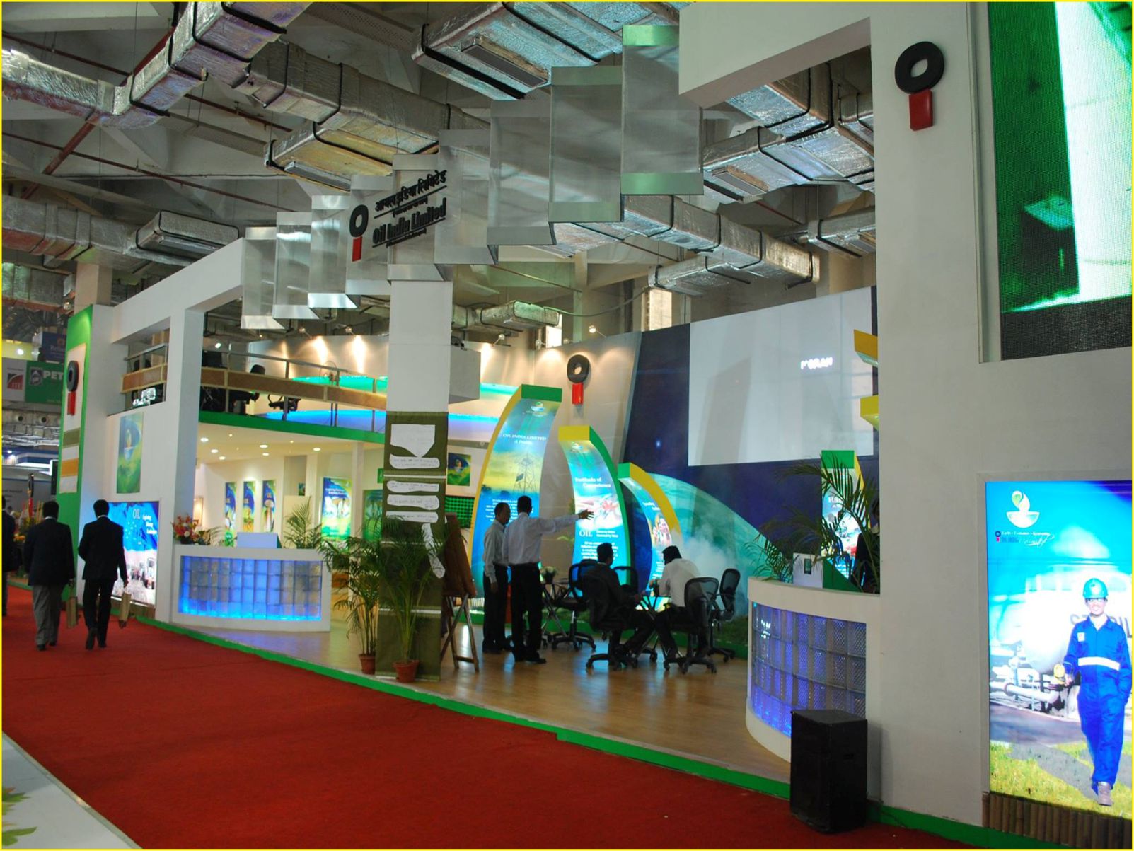
- Green: Growth, sustainability, health
- Yellow: Optimism, creativity, warmth
- Purple: Luxury, innovation, wisdom
- Orange: Friendliness, confidence, adventure
- White: Clarity, cleanliness, simplicity
- Black: Sophistication, luxury, power
The 60-30-10 Rule for Exhibition Stands
Creating a balanced colour scheme involves following the classic interior design principle of the 60-30-10 rule:
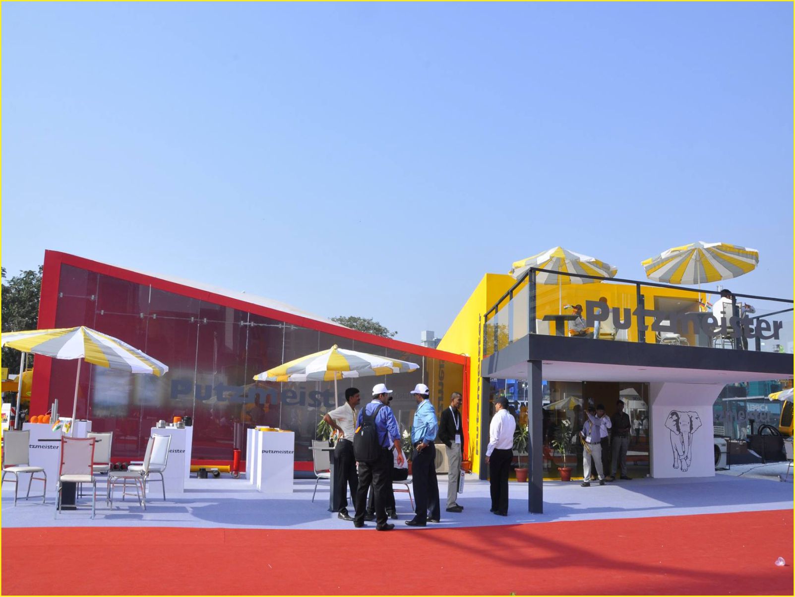
- 60% Primary Colour
- Main structure and walls
- Large backdrop areas
- Primary flooring
- 30% Secondary Colour
- Furniture pieces
- Display units
- Accent walls
- 10% Accent Colour
- Graphics and signage
- Accessories
- LED lighting features
Factors Influencing Colour Selection
1. Brand Guidelines
- Maintain consistency with your existing brand colours
- Consider creative ways to incorporate brand colours without overwhelming the space
- Balance brand recognition with stand aesthetics
2. Industry Context
Technology Sector:
- Blues and silvers for innovation
- Clean whites for simplicity
- Bright accent colours for energy
Healthcare Industry:
- Blues and greens for trust and wellness
- White for cleanliness
- Soft accent colours for comfort
Luxury Brands:
- Black and gold for premium feel
- Deep purples for exclusivity
- Metallic accents for sophistication
3. Exhibition Environment
- Consider the lighting conditions in the venue
- Account for neighboring stands’ designs
- Factor in ceiling height and space dimensions
Strategic Colour Implementation Tips
1. Creating Visual Hierarchy
- Use brighter colours to highlight key products
- Implement darker shades for private meeting areas
- Apply neutral tones for transition spaces
2. Lighting and Colour Interaction
- Consider how artificial lighting affects colour appearance
- Plan for different times of day
- Use LED lighting to enhance or change colour schemes
3. Cultural Considerations
- Research colour meanings in different cultures
- Consider your target audience’s cultural background
- Avoid potentially problematic colour combinations
Common Colour Scheme Mistakes to Avoid
- Overwhelming Visitors
- Using too many bright colours
- Lacking visual rest areas
- Inconsistent colour application
- Poor Contrast
- Text illegibility
- Unclear wayfinding
- Weak brand visibility
- Trending Over Branding
- Following colour trends blindly
- Ignoring brand guidelines
- Sacrificing recognition for aesthetics
Practical Colour Selection Process
Step 1: Analysis
- Review brand guidelines
- Research target audience preferences
- Analyze successful competitors
Step 2: Planning
- Create digital colour mockups
- Test different lighting scenarios
- Consider material finishes
Step 3: Implementation
- Order material samples
- Test colours under different lights
- Create a detailed colour specification document
Colour Schemes for Different Stand Sizes
Small Stands (9-18m²)
- Use lighter colours to create space
- Limit palette to 2-3 colours
- Implement vertical colour blocking
Medium Stands (18-36m²)
- Balance open and intimate spaces
- Create zones through colour
- Use colour for wayfinding
Large Stands (36m²+)
- Develop colour-coded areas
- Create sophisticated colour transitions
- Implement dramatic colour features
Measuring Colour Scheme Success
Track these metrics to evaluate your colour choices:
- Visitor dwell time
- Photo opportunities taken
- Social media mentions
- Lead generation numbers
- Post-show surveys
Conclusion
Selecting the right colour scheme is a strategic decision that requires careful planning and consideration of multiple factors. The perfect palette balances brand identity, visitor psychology, and practical considerations while creating an inviting and memorable exhibition space.
Need expert help in selecting and implementing the perfect colour scheme for your exhibition stand? Contact Leafylane Design for a consultation with our experienced design team.